
Progressively enhance your star ratings with modern CSS
Let’s build a progressively enhanced star ratings UI. Enhancements are going to come from three new CSS functions: color-mix(), sibling-index() and sibling-count().
Contents
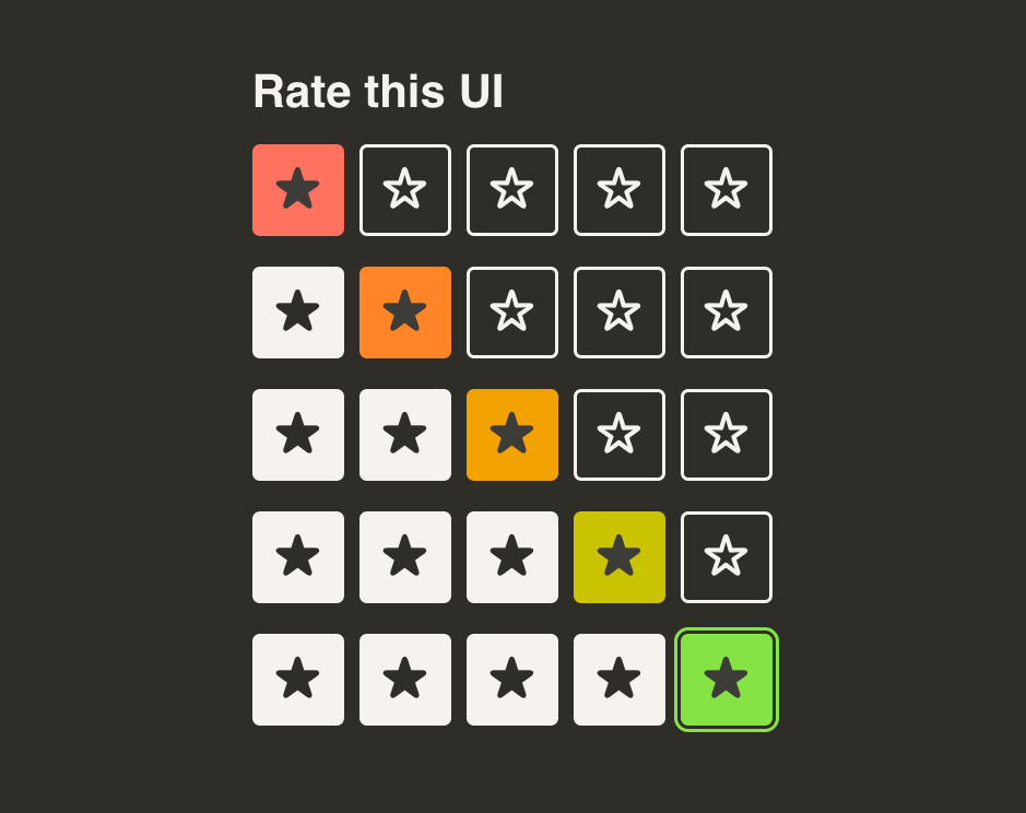
I’ll introduce these new functions first, and then we’ll dive into building our component.
color-mix()
The color-mix() function is defined in the CSS Color Module Level 5 specification. It takes a colour space (eg. srgb, hsl, oklch, etc.), two colours and percentages for mixing. These can be any “type” of colour: hex values, colour names, keywords like transparent.
It looks a bit like this:
.no-mix { background-color: red; }
.mix-1 { background-color: color-mix(in hsl, red 50%, transparent 50%); }
.mix-2 { background-color: color-mix(in hsl, red 50%, #0f0 50%); }

/* Percentage can be added to either one or both of the values
Pure red. Red mixed with 50% transparency. Red mixed with 50% green.
sibling-index() and sibling-count()
These are pretty new in the CSS World. But I’m writing this blog with confidence now because Firefox supports sibling-index() and sibling-count(). So, what are they? Each returns a number:
sibling-count(): Represents the number of siblings for an element, including the element itself.
<style>
  li { --count: sibling-count(); }
</style>
<ul>
  <li>Item 1</li>
  <li>Item 2</li>
  <li>Item 3</li>
  <li>Item 4</li>
</ul>
In the above example, --count would be calculated as 4.
sibling-index() for an element returns where in the sequence it lives.
<style>
  .special { --index: sibling-index(); }
</style>
<ul>
  <li>Item 1</li>
  <li>Item 2</li>
  <li class="special">Item 3</li>
  <li>Item 4</li>
</ul>
In the above example, --index would be calculated as 3.
Building the ratings UI
Keep the above techniques in the back of your mind. Next, we’ll build the UI, using a series of radio inputs.
<label>
  <input type="radio" name="rating" value="1" />
  1 star
</label>
<label>
  <input type="radio" name="rating" value="2" />
   2 stars
</label>
<label>
  <input type="radio" name="rating" value="3" />
  3 stars
</label>
<label>
  <input type="radio" name="rating" value="4" />
  4 stars
</label>
<label>
  <input type="radio" name="rating" value="5" />
  5 stars
</label>
The bare radio buttons and the text look a little uninviting, so we’ll hide the text and radio inputs visually and add star icons. We’ll style the labels to give them a button-like appearance. Don’t forget hover, active and focus states for these! Let’s also wrap them in a <div> so we can apply a flex display with gaps.
We’re getting somewhere. This is starting to look pretty good! One issue here is that when you tap on a star, you’re really only lighting up 1. We can fix this with a few:has() pseudo-classes combined with sibling (~) selectors, no problem.
Bringing in the big-guns
Let’s take what we’ve learnt about color-mix() and the sibling-*() functions and bring in a little colour. To do this, we’re going to set two colours. They can be anything, but we’ll go with red for one star and green for 5 stars. We can set these two values in:root.
:root {
  --color-bad: red;
  --color-good: limegreen;
}
For each button, the colour can be a mixture of red and green. I’ve chosen the OKLCH colour space. This ensures a consistent contrast as the hue changes.
.button {
  background-color: color-mix(
    in oklch,
    var(--color-bad),
    var(--color-good) 50%
  );
}
This will give a yellowish colour because it’s mixing red with 50% green. This works great for the middle button, but we want to ensure the percentage can change depending on where the button sits in the ratings panel.
Let’s bring in our sibling-*() functions.
.button {
  background-color: color-mix(
    in oklch,
    var(--color-bad),
    var(--color-good)
    calc(
      (sibling-index() - 1)
      / (sibling-count() - 1)
      * 100%
    )
  )
}
What’s happening here? So just dividing the index by the count and multiplying by 100% doesn’t get you exactly what you need. The first button ends up having 20% green. And the last button has only 80%, rather than the first and last buttons being full colour.
Minus 1 on the first item means the first star gets 0, which returns 0%. Minus 1 on the index means the last item gets 4/4 * 100%, which, of course, is 100%.
You can play with the result of this in this CodePen:
Progressively enhanced!
Before we finish, in the example, the inputs are wrapped in a fieldset with a legend. This ensures that assistive technology can fully describe the radio buttons to the user.
The advantages of the Modern CSS approach include:
- Having as many stars as you like. The colour mixes will adapt.
- Choosing your own colours. You can also have dark-mode versions with either a media query or the
light-dark()function. - A fallback to a still-usable solution without the rainbow colours: a nice progressive enhancement.
What’s the takeaway?
As you can see, building things requires a lot less JavaScript. Of course, this still has a purpose, but quite often it serves as a polyfill.
Now, these new CSS properties provide real browser-powered solutions that ensure fewer magic numbers and much more robust techniques. They also let you use structured HTML where possible and keep the codebase slim.
My wishlist
Whilst, to me, this little UI serves as a cool use-case for new tools like sibling-count(), it makes me wish for more. I would love, for instance, that I could make the set of stars take the colour of the last one chosen. Having them all turn green when the last one’s selected would be the icing on the cake. But we’re not quite there yet.
One of the ways we will get there is by using these techniques in our work and, maybe, writing about it. The web community is surprisingly close-knit.
Back to top