
Opinionated Typography: Scale
Most of what you look at on the web is text. Even if you’re watching videos. And there are a million different takes on what makes great typography. I think it’s fair, then, to throw my hat in the ring.
Contents
The font scale
There’s been a lot of debate about font scales and which ones to use. Some people go with something based on a “traditional” scale inherited from metal type foundries. You’ve seen these in things like Microsoft Word (6, 8, 9, 10, 11, 12, 16, 18, etc.).
Some just eyeball it. But this really isn’t sustainable or maintainable in the squishy world of web design. Today’s approach is basing scales on a ratio.

The top row is the legacy scale used by word processors. The bottom row uses a 1.2 scale.
The advantage here is that there aren’t magic numbers everywhere. Just one.
This is the first thing to set up, and with a few modern techniques, a whole font-size scale can be produced in a jiffy.
:root {
  --font-size-ratio: 1.2;
  --font-size-base: 1em;
  --font-size-1: calc(var(--font-size-base) * pow(var(--font-size-ratio), 1));
  --font-size-2: calc(var(--font-size-base) * pow(var(--font-size-ratio), 2));
  /* etc. */
}

.fs-base { font-size: var(--font-size-base); }
.fs-1 { font-size: var(--font-size-1); }
.fs-2 { font-size: var(--font-size-2); }
/* etc. */
You’re probably familiar with Custom Properties (--custom-prop). But what’s new here is the pow() function: the power function. pow(x, 2) is the same as x². Multiplying the base font size by the ratio to the power of the step number creates that step’s new font size.
If you’re using Sass (SCSS), you can create full ramps in a few seconds:
:root {
  --font-size-ratio: 1.2;
  --font-size-base: 1em;
  @for $i from -2 through 3 {
    @if $i == 0 {
      --font-size-#{$i}: var(--font-size-base);
    } @else {
      --font-size-#{$i}: calc(var(--font-size-base) * pow(var(--font-size-ratio), #{$i}));
    }
  }
}
As you can see here, it works for negative numbers too. You can tweak the ratio, the base font-size and the number of sizes you want, in both directions.
As a side note, and as a musician, I like to pick something from the musical harmonic scale as the ratio. The 1.2 here is a “Minor Third”.
Where it gets interesting, though, is how to deal with screen sizes.
Line height
As a bonus, this approach also works for line height. I find line heights should decrease as we go up our heading levels. Tighter spacing helps big headings feel a bit more balanced.
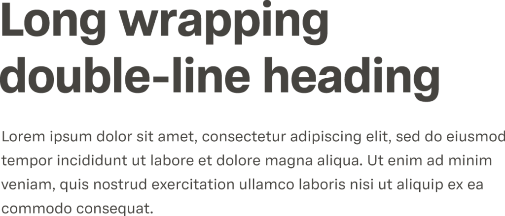
The heading here uses a 1.2 line height ratio, and the body text uses 1.6.
:root {
  @for $i from -3 through 0 {
    $calc: calc(var(--line-height-base) * pow(var(--line-height-ratio), $i));
    --typography-line-height-#{$i} : #{$calc};
  }
}
History lesson time
Now, before we had to worry about different screen sizes, we all worked off 800 by 600px frames. It was all so simple!
Then Ethan Marcotte wrote this article back in 2010 for A List Apart, introducing the concept of the “responsive web” to terrified developers. But it meant that one codebase could serve multiple screen sizes. If you’re old enough, you’ll remember special “mobile” versions of websites that served, really, a completely different website than the desktop version. mob.examplewebsite.com or examplewebsite.com/mobile. Responsive websites were an alternative to “adaptive” websites.
Media Queries
But things weren’t quite responsive. @media queries were introduced, allowing the same CSS file to change things in “steps” or at breakpoints. This was true of typography. Every heading had a number of different versions. A mobile h1 and a desktop h1, and possibly a few in between.
The BBC website introduced the idea of “cutting the mustard”. The idea was that users with the most basic devices were served the “mobile” experience: the UI was typically stacked. And as the devices got more capable and larger, the more complex layouts kicked in. So, rather than designing for desktop and adapting to mobile, it worked the other way around. This could be a whole other blog, but it made sense to design “upwards”, with all media queries being a breakpoint size and above.
body { font-size: 16px; }

h1 { font-size: 20px; }

@media screen and (min-width: 600px) {
  h1 { font-size: 24px; }
}

@media screen and (min-width: 900px) {
  h1 { font-size: 30px; }
}
Of course, em or rem units are a better choice here, and em for media queries is also a better choice if you want media queries to scale with text size, but you get the idea.
Fluid typography
So, I said that “responsive” design, as described above, isn’t quite responsive. Things still hinge on breakpoints and steps, meaning that how a webpage looks can change dramatically as soon as one of these thresholds is crossed.
Enter viewport units. These basically represent a percentage of the viewport width, height, or whichever is smallest or largest: vw, vh, vmin, vmax. Developers started to realise that font sizes could be set with these, essentially making text expand or contract based on screen size.
The challenge here is that large screens will have humongous font sizes, and mobile screens will have minute font sizes. The clamp() function allows you to set limits on either side and use viewport units for the fluid, in-between sizes.
--font-size-fluid-1: clamp(var(--font-size-1), 1.5vw ,var(--font-size-2));There are two issues here:
- The
1.5vwis a bit of a guess, and really a bit of a magic number. It is possible, with some more calculations, to work out a “slope” between a minimum and maximum viewport size, but it’s not elegant. - It’s a challenge getting this to work for user font scaling, especially if the upper limit prevents scaling above a certain size.
Progress
progress() is a fairly new function, but it’s pretty well supported across browsers. It’s a little strange function. It takes three values: the amount, a lower bound and an upper bound. It always returns a pure, unitless number. The values can themselves be unitless or have units. This means you can take 100vw and create a “slope” between a minimum viewport width and a maximum viewport width.
progress(100vw, 400px, 1200px);

/*
At 400px, 100vw = 0
At 1200px, 100vw = 1
At 800px, 100vw = 0.5
*/
With a few parameters, you can create a calculation that builds a fluid size:
:root {
  --ratio-min: 1.2;
  --size-min: 1em;
  --viewport-min: 400px;
  --ratio-max: 1.25;
  --size-max: 1.2em;
  --viewport-max: 1200px;

  --_progress: progress(100vi, var(--viewport-min), var(--viewport-max));

  --_min-0: calc(var(--size-min) * pow(var(--ratio-min), 0));
  --_max-0: calc(var(--size-max) * pow(var(--ratio-max), 0));
  --font-size-fluid-0: calc(var(--_min-0) + var(--_progress) * (var(--_max-0) - var(--_min-0)));

  --_min-1: calc(var(--size-min) * pow(var(--ratio-min), 1));
  --_max-1: calc(var(--size-max) * pow(var(--ratio-max), 1));
  --font-size-fluid-1: calc(var(--_min-1) + var(--_progress) * (var(--_max-1) - var(--_min-1)));
}
Again, with a little help from Sass, you can create a loop to output a full font scale ramp in a flash:
:root {
  @for $i from -1 through 3 {
    --_min-#{$i}: calc(var(--size-min) * pow(var(--ratio-min), #{$i}));
    --_max-#{$i}: calc(var(--size-max) * pow(var(--ratio-max), #{$i}));
    --font-size-fluid-#{$i}: calc(var(--_min-#{$i}) + var(--_progress) * (var(--_max-#{$i}) - var(--_min-#{$i})));
  }
}
This solves both problems posed by the clamp solution. If you want to be a bit more backwards compatible, you can do a simple @supports check and have the older clamp solution as a fallback.
@support (opacity: progress(5, 0, 10)) {
  /* progress() -based type scale here */
}Give it a go yourself with this CodePen.
Just one more thing…
We can make our work even more efficient using the @function rule, so the reasonably busy calculations can be consolidated into one place:
@function --type-size-fluid(--n) {
  --_min: calc(var(--size-min) * pow(var(--ratio-min), var(--n));
  --_max: calc(var(--size-max) * pow(var(--ratio-max), var(--n));

  return: calc(var(--_min) + var(--_progress) * (var(--_max) - var(--_min)));
}
These can then be slotted into our CSS like:
@supports at-rule(@function) {
  :root {
    --font-size-fluid--2: --type-size-fluid(-2);
    --font-size-fluid--1: --type-size-fluid(-1);
    --font-size-fluid-0: --type-size-fluid(0);
    --font-size-fluid-1: --type-size-fluid(1);
    --font-size-fluid-2: --type-size-fluid(2);
    /* etc. */
  }
}Note: ironically, @supports at-rule(*) is only supported in Chrome! So use it as a progressive enhancement for now. It will just be ignored in older browsers.