Design for humans
Are we designing for search engines? Robots? Quick bucks? Have we forgotten how to design for people?
I’m in my mid-forties and, after twenty-plus years in a digital product company, I, like many folk, have found myself “self-employed”. Unless you’ve been hiding under a rock for the last couple of years, you’ll see that one thing has caused a major upset in my industry: AI.
It hasn’t necessarily created a new problem, but exacerbated an issue with digital products that’s existed for a long time. We’ve forgotten how to design for people. And, as useful as AI is as a tool, things aren’t much better.
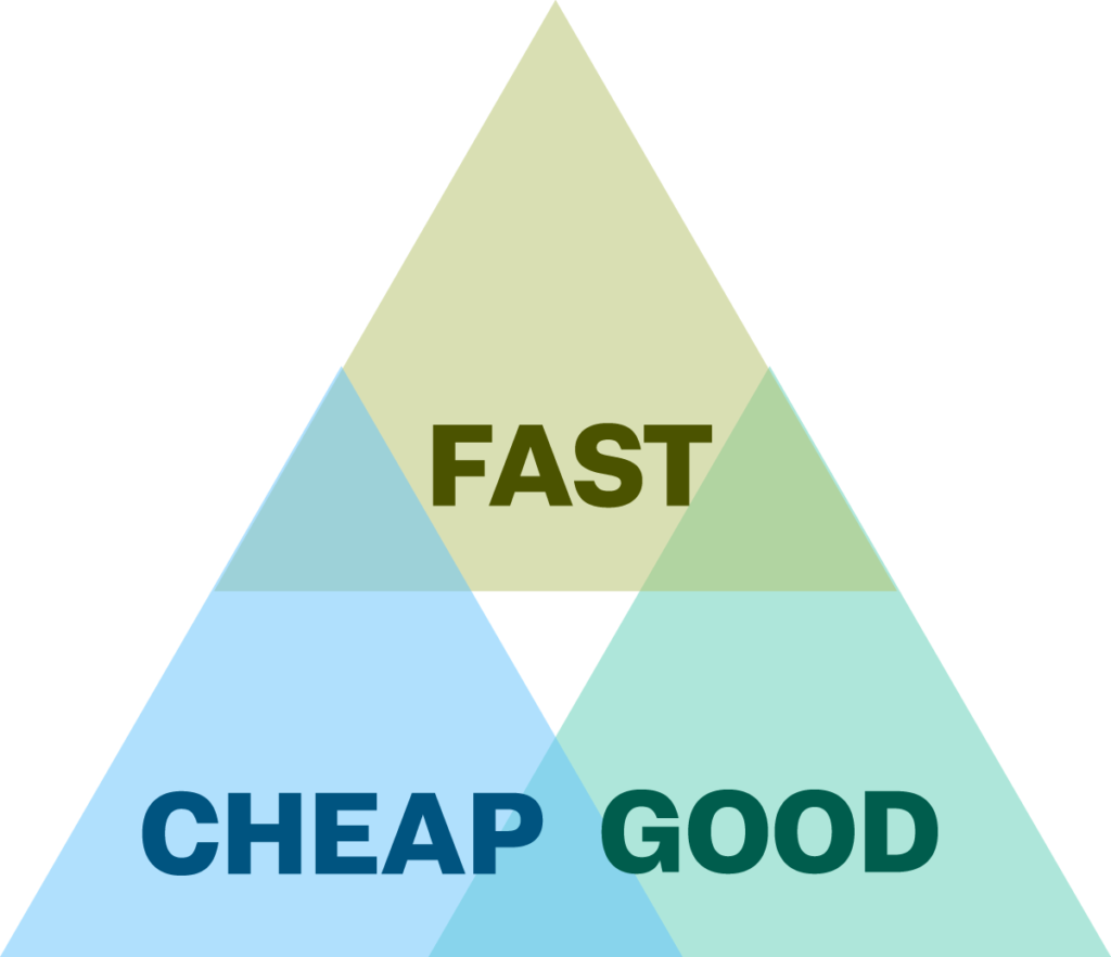
There’s the famous “Iron Triangle”: you can have fast, good or cheap, but not all three. The challenges facing the industry have meant that “good” has taken a back seat, and we’re hoping, fingers crossed, that AI will sort out the “good” after the next prompt.
Marquee tags
I’ve been working with the web from what it seems like the early days. I remember learning HTML with all its weirdness as it found its feet. <marquee> and <center> tags, anyone? And laying websites out with tables. As crude as things were, understanding the structure that holds everything together became a bit of an obsession. You see, I didn’t train in IT; I came out of an engineering degree. And with engineering, structure is everything. Solid foundations.

The good old <marquee> tag!
Through the years, “accessibility” has always been one of those aspects of web design, along with user experience, user interfaces, responsiveness and performance. But, it seems out of all of these, accessibility has been treated like the ugly sister.
A web designer can get away with a nice interface or having something work on mobile. But, designing for people not like them… that’s an add-on. An optional extra. Too expensive. Annoying.
Scratching an engineer’s itch
But the more I looked into how accessibility fits into the whole, I realised it scratched my engineer’s itch. It relies on good structure: the thing that a good website should be built on. And the realisation that if we take accessibility seriously, it doesn’t just help those who need assistance; it helps everyone! It’s foundational (not an optional extra) to building products for humans!
Through my years of working in web design, I’ve been slowly becoming a champion of this kind of thinking (Some might say, a nagging pain-in-the-butt). But it takes a lot of convincing for it to be seen as a fundamental part of our work. Engineers are just not taught it in university, it seems. Managers don’t understand it enough to work it into their pricing. And designers see accessibility as something that gets in the way of beautiful designs. And that’s the thing I want to challenge.
Unfortunately, for too long, accessibility has the reputation of a legal document or red tape. It’s portrayed as clinical, a list of “do’s and don’ts”. It comes across as the opposite of interesting or engaging. You see the problem?
Human problems
I’m not old, but I do notice the effects of ageing. My eyesight in particular. I used to laugh at my dad holding a newspaper at arm’s length so he could focus on it. Guess who’s doing that now? My peers are using their phones with the text size at jumbo. And I see and hear people constantly getting frustrated with technology. And not just technology: the world around them.
Recently, a young person came up to me on a train asking if this was going the way they wanted to go. I said, “I hope so”. It was funny, but for an able human being, the lack of signposting meant that she thought she could be whisked away to the other end of the country. Making things clear and accessible isn’t and shouldn’t be boring. It’s what interesting design builds on. It’s the foundation: the structure.
Here we go…
In this blog, I’m going to dive into a range of topics. I’m a nerd, so there’s going to be a focus on new web features. I love CSS, and it excites me, so there’s going to be a lot of that. But all of it is to say that in this day and age of automation that is only going to get more automated, designing for all humans has never been more important. We’re going to explore accessibility, language, UI’s and real-world design. There may be a few other self-indulgent bits-and-pieces thrown in, but I’m sure you don’t mind. I’m human, after all.